Color of the Year: Off-White Is On Trend for 2016
By Jennifer Ott
It’s the time of year when many paint manufacturers and color forecasters release their picks for top shades for the coming year. And while these selections typically vary widely from company to company, one emerging trend for 2016 is what some would call a colorless color: white or, more specifically, shades of off-white. Here are four major paint brands’ achromatic color picks and how best to use them in your home.
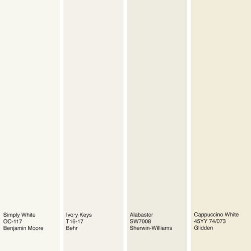
Shown here: Simply White from Benjamin Moore, Ivory Keys from Behr, Alabaster from Sherwin-Williams and Cappuccino White from Glidden.
In 2014, Benjamin Moore’s pick was the subtle sky blue Breath of Fresh Air, and last year, it chose the light and neutral Guilford Green. Simply White is perhaps the next logical choice in Benjamin Moore’s evolution toward barely there, wispy hues. Unlike color management company Pantone’s recent selections, these shades are soft and neutral enough to be used generously in a space, rather than as a small accent only.
If you prefer whites with a little more substance, check out Sherwin-Williams’ Alabaster. This neutral white doesn’t veer too far to the warm or cool side and pairs nicely with pretty much any other color.
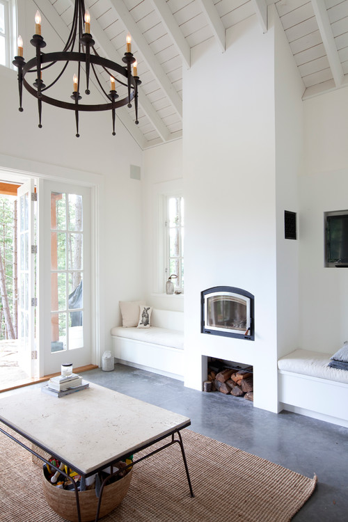
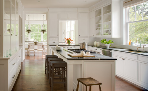
Here’s another room clad in Simply White, from Benjamin Moore. White spaces can often feel cold and sterile, but you can counteract this if your space has striking architectural details and charming furniture, fixtures or accessories. In fact, the white wall color allows these details to take center stage where a vibrant color would be too distracting.

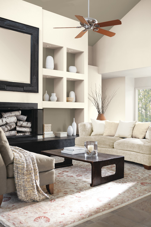
For those who want a mix of colors in a room but aren’t fans of brights and bolds, try a sampling of neutral whites, grays and browns instead. It makes a visually interesting, warm and welcoming space without going over the top with color. A bonus of a neutral-only room is that it won’t feel dated as quickly as one clad in vibrant trendy colors. The walls here are painted in Alabaster, from Sherwin-Williams.
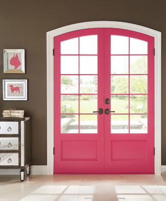
Even lovers of bold color need white or light neutrals to break up the palette. I like to think of this as the critical “negative space” that artists incorporate into their works. It’s the white or blank space necessary to allow the main elements of the composition to shine. This vivid door gets a visual break via trim painted in Behr’s Ivory Keys.
Original Source: Houzz
Read the original article here
Original article: The Province
Read original aricle here.