3 colour palettes to help set your garden's mood
By Lauren Dunec Hoang
Nothing has more immediate impact on the mood of a garden than color. When it comes to putting together a garden color palette, you can first decide how you want a space to make you feel and then choose the color scheme accordingly. If you want a cheerful and inviting space, choose foliage and blooms in light and medium pastel shades. If you’d like to feel energized, go for a high-contrast pairing of fiery red flowers and deep purple foliage. For a feeling of tranquility, turn to blooms in peaceful blues and whites.
Don’t know where to begin? Take a look at garden beds in three pleasing color palettes that each set a specific mood for the landscape.
Why bother with a color palette? Gardens with too much variety can feel overwhelming and look cluttered. Sticking to a color scheme for a planting gives a garden a balanced, put-together look and can help you avoid impulse purchases at the nursery. It’s up to personal taste, but limiting the number of different colors to no more than five can be a helpful rule of thumb. While this may seem constraining, adopting a more disciplined approach to plantings can harmonize the look and feel of your garden without sacrificing plant diversity.

1. Cheerful and Inviting Color palette: Medium blue-green, light green, bright orchid, eggshell, deep violet
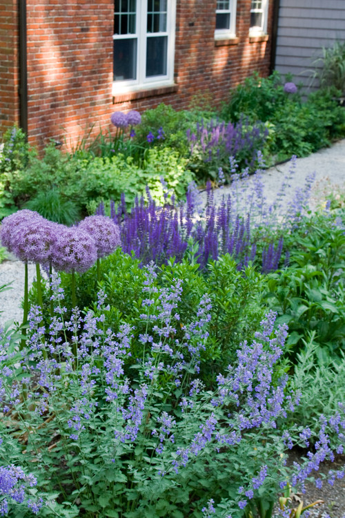
Evoke the look of Monet’s garden in Giverny with a watercolor palette of pink, blue, purple, green and soft yellow. Pastels feel fresh and harmonious in the garden, transitioning smoothly from one soft hue to the next. Like the first blooms in spring, pastel color palettes feel cheerful and inviting — making them a great choice for entryway and front yard plantings.
Pastel color palettes can include all hues on the color wheel in muted tones. Adding one or two plants in a more saturated color — like a dark green-leaved shrub or deep purple perennial — can keep a pastel color palette from looking washed out.
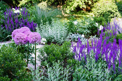
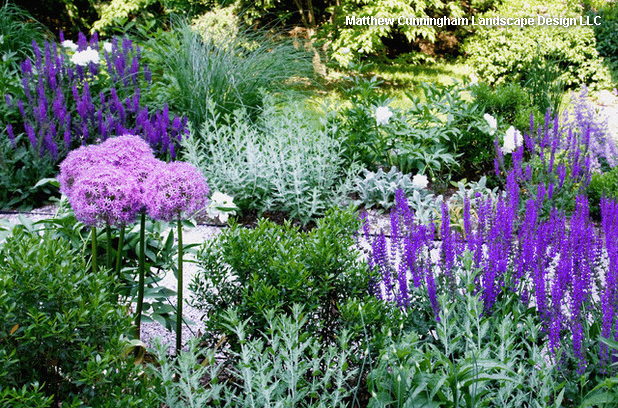
In this woodland garden outside of Boston, the designer banked the beds with pastel blooms mixed with plants that have silver to medium green foliage. Here we see white peonies, dark purple ‘May Night’ sage (Salvia ‘May Night’), lavender-pink ‘Globemaster’ alliums (Allium ‘Globemaster’), silver-leaved Russian sage (Perovskia atriplicifolia), lamb’s ears (Stachys byzantina) and evergreen inkberry (Ilex glabra).
Concentrating on blues and purples in a pastel palette creates a calmer and more tranquil feel than pastel schemes that include yellows and pinks. In the same garden, catmint (Nepeta sp.) blends with dark purple ‘May Night’ sage, lavender-pink ‘Globemaster’ allium and lady’s mantle (Alchemilla mollis) for a calming walkway planting.
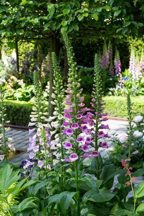
Tall spikes of pink and pale lavender foxgloves (Digitalis purpurea) and light pink peonies (Peony ‘Elsa Sass’) provide punctuations of pastel color amidst the verdant borders.
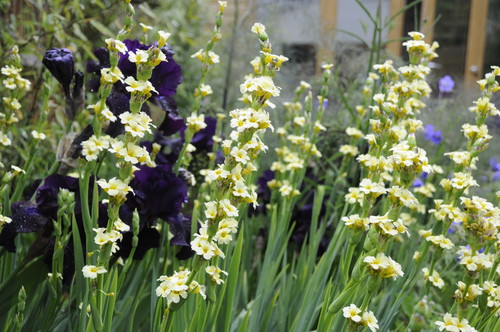
2. Dramatic and Energizing Color palette: Pomegranate, dark purple, yellow orcher, periwinkle blue, medium gray-green
High-contrast jewel-toned color palettes command attention, making eye-catching border displays that stand out on the block. Gardens in this rich color palette shine all year but are particularly dramatic in late summer and fall, when the deeply saturated tones complement the red, orange and amber leaves of trees changing color.


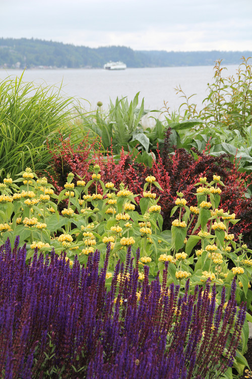
Gardens using jewel-toned color palettes benefit from tones chosen from opposite sides of the color wheel (like orange and blue or yellow and violet). Pairing plants with foliage or flower colors in closely complementary hues makes each color stand out in contrast to its neighbors. For example, in this seaside garden on Bainbridge Island, Washington, dark purple ‘Caradonna’ sage (Salvia nemorosa ‘Caradonna’) and cool blue ‘Little Titch’ catmint (Nepeta racemosa ‘Little Titch’) set off bright orange California poppies (Eschscholzia californica) planted close by.
In another shot of the same garden, yellow-flowering Turkish sage (Phlomis russeliana) grows sandwiched between dark purple ‘Caradonna’ sage in the foreground and dark red barberry (Berberis sp.) in the background.
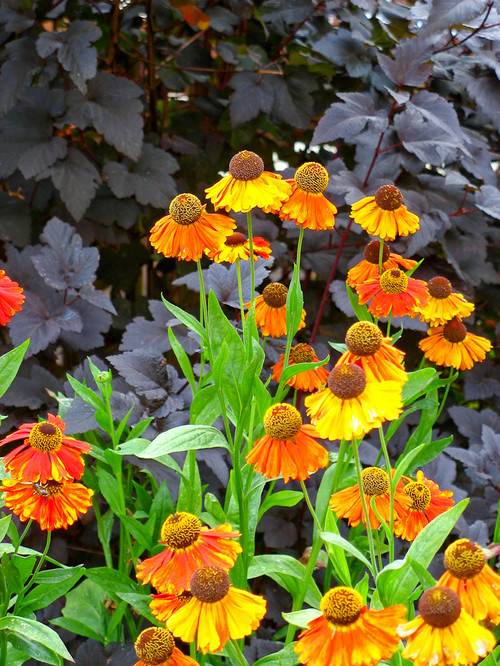
Here, a jewel-toned planting duo of fiery orange Mardi Gras’ sneezeweed (Helenium ‘Mardi Gras’) and dark plum ninebark foliage (Physocarpus opulifolius ‘Diabolo’) creates a punchy, high-contrast display.
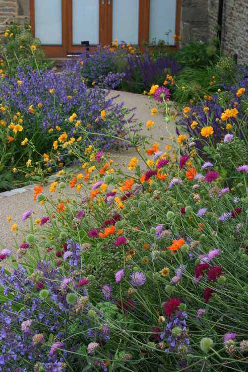
In a mixed floral border in a garden near Sheffield, England, the designer used an engaging color palette of gold and bright orange avens (Geum spp.), and dark crimson and pale purple pincushion flowers (Scabiosa rumelica syn. Knautia macedonica). The overall effect is like a sprinkling of bright jewels over a dark backdrop (the green foliage).
3. Cool and Serene Color palette: Leaf green, light sage, white, deep blue, sky blue
As calming as puffy white clouds moving across the sky or a sailboat on the water, planting palettes made up of blue and white blossoms set the tone for a tranquil landscape. To keep beds looking crisp and clean, restraint with the color palette is key. Choose blooms in clear shades of blue and as close to true white as you can find, and mix them with plenty of evergreen foliage.


In this backyard in Westport, Connecticut, the designer used a mix of white- and blue-flowering bigleaf hydrangeas (Hydrangea macrophylla), medium blue veronica, pale purple-blue catmint (Nepeta sp.) and white roses.

In another New England garden, clear lavender-blue bloom spikes of Russian sage (Perovskia atriplicifolia) mix with abundantly flowering white bigleaf hydrangeas and evergreen boxwood (Buxus sp.). The planting trio forms a peaceful garden scene.
Original article: Houzz
Read original article here.
Original article: The Province
Read original aricle here.